
A sidebar, not a tab bar
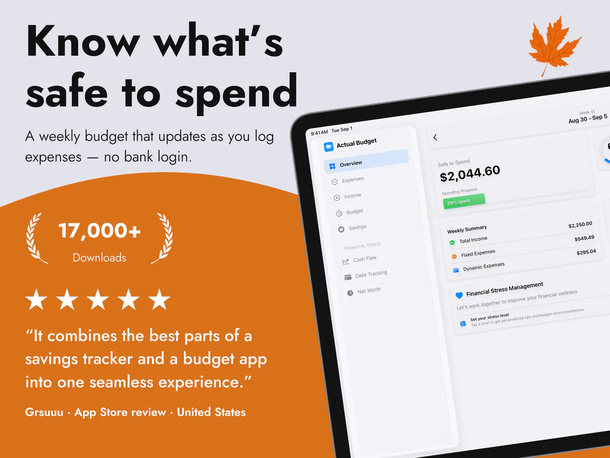
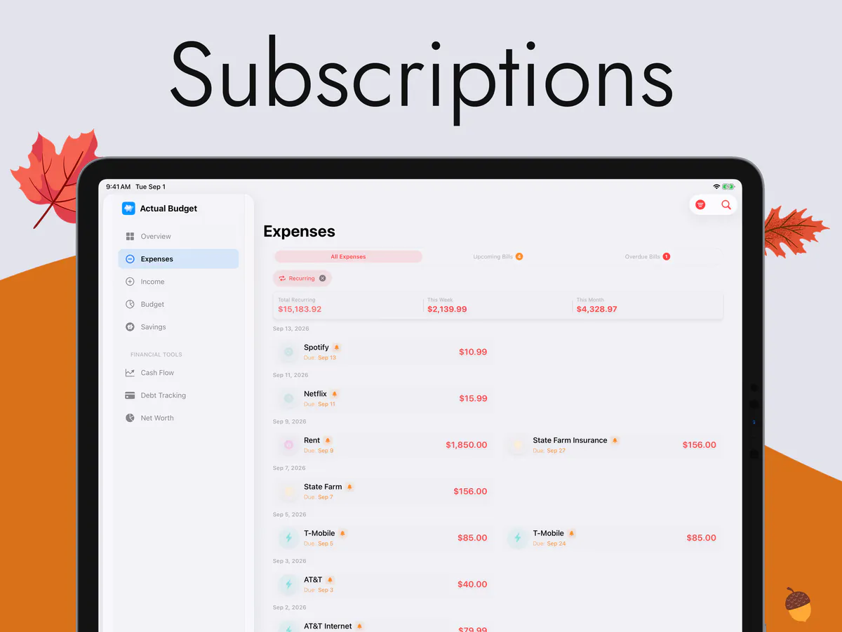
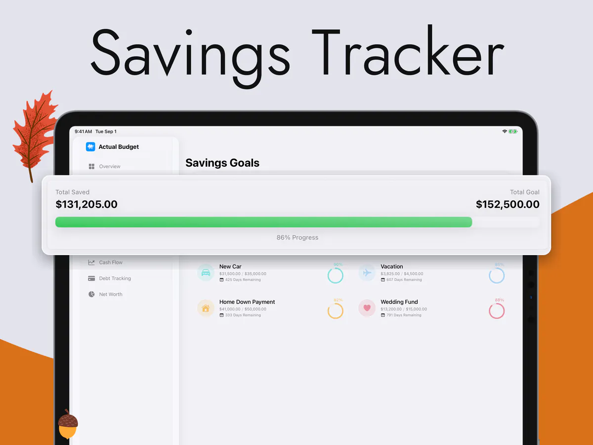
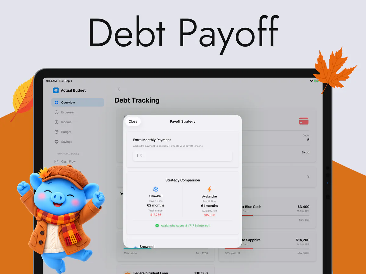
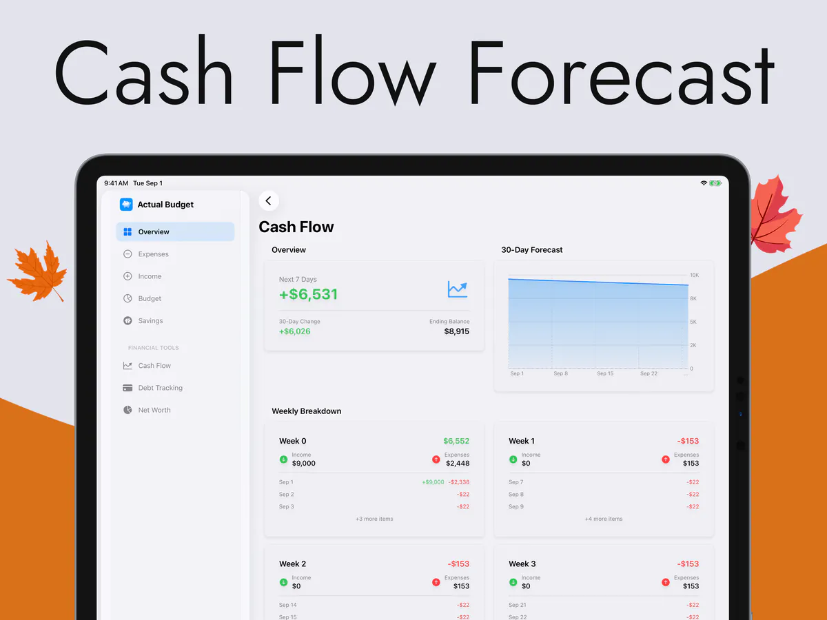
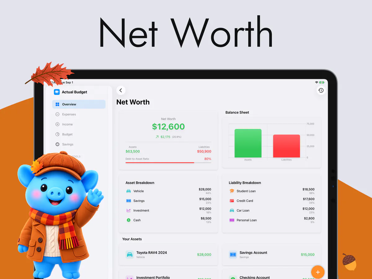
The iPad gets a real sidebar down the left, so every section is one tap away and none of them is hidden behind a "More". The tab bar belongs to the phone and stays there.
Not a phone screen stretched sideways. Its own sidebar, its own landscape layout, and enough room to see the week and the detail at the same time — with the same budget on your iPhone.
An independent app by Halim Öztürk. Not affiliated with actualbudget.org and it does not connect to an Actual Budget server.
What is actually different on iPad
You can tell within a second: a tab bar marooned at the bottom of a 13-inch screen, one column of content down the middle, and half the glass empty. This is a different layout, not a bigger one.
The iPad gets a real sidebar down the left, so every section is one tap away and none of them is hidden behind a "More". The tab bar belongs to the phone and stays there.
The app is landscape on iPad, deliberately and only. Every screen was drawn for that shape rather than tolerating it, which is why nothing is a tall column with margins either side.
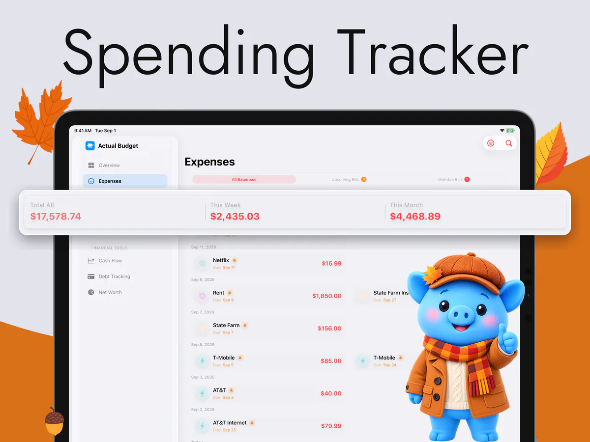
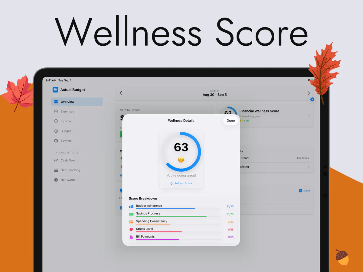
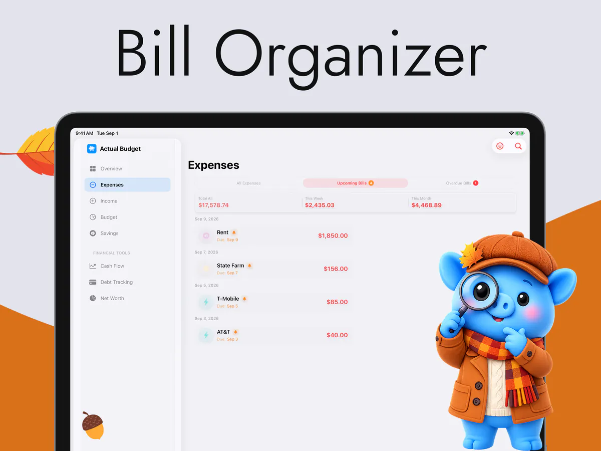
The extra width is spent on showing more at once — the number, what it is made of, and the list underneath it — instead of on wider white space around the same phone layout.
From the App Store
This app deserves more attention. It combines the best parts of a savings tracker and a budget app into one seamless experience.
Grsuuu · App Store review · United States
Quoted word for word from a review on the App Store.
iPhone and iPad together
Add an expense on the phone in the shop, and it is on the iPad when you sit down with it. Sync runs through your own private iCloud, between your own devices — there is no account to create, no server of ours in the middle, and we cannot read any of it.
It is optional. Turn it off and the iPad simply keeps its own budget. And nothing here needs a bank connection: there is no bank login, no aggregator and no statement import anywhere in the app, on either device.
On the Home Screen
Put what is left for the week on the iPad's Home Screen and you will see it every time you unlock the thing. The next bills and your savings goals have widgets of their own, and there are Lock Screen widgets on the iPhone side.
Your records stay on the device. Merchant names, notes and account names are not sent, apart from a few names you type for bills, savings goals and income sources, which the Privacy Policy lists. The app does send anonymous usage analytics, and some of those events include amounts — the Privacy Policy lists exactly which and why. No ads, and no advertising SDK.
What is on the screen
Everything the iPad layout does with its extra room is in service of one figure: what is safe to spend for the rest of this week.
The full feature list and every screen are on the main page.
Questions
No — the iPad app is landscape only, and that is a design decision rather than a gap. Every iPad layout in the app is built around the wide shape; allowing portrait would mean shipping a second set of layouts that were worse. On iPhone it is the other way round: portrait only.
No. It is one app and one purchase, and it carries across both because it is tied to your Apple Account. The App Store shows the price for your country — we do not print one here, because this page cannot know which store you are buying from.
Neither. There is no bank login, no aggregator and no statement import, and there is no account to sign up for. You enter what you spend, and it works offline.
Any iPad on iPadOS 18 or later. Day to day it needs no connection at all — the arithmetic happens on the device. A connection is used only to sync through iCloud between your devices, if you turn that on.
Free to download, for iPhone and iPad. No bank login, no account, no ads.